I have been publishing Race Predictions for a few years now, so it’s about time to have a look at how “good” my predictions are. When I started in 2011, there were quite a few changes in the algorithm and the parameters to deal with a number of edge cases. During 2015 there have not been any changes, so this is a good data pool for validation.
Data Used
In 2015 I have published predictions for 36 Professional Ironman-distance races, 31 Ironman-branded races by WTC and 5 more Challenge races.There have been a total of 1098 finishes, 688 by male athletes (62.7%) and 410 by females (37.3%). These were posted by 600 different athletes, 382 male (63.7%) and 218 females (36.3). In addition there were 349 DNFs, 244 by males (70%) and 105 by females (30%).
Using my algorithm and the available start lists, I have seeded the participants in each of the races, and predicted 930 finishing times (84.7% of all finishers). There are some cases when I didn’t predict the finishing times, for example when an athlete didn’t have any prior IM-distance finishes or when there was a late entry (and therefore the athlete not included in the start list).
Predicting the Winners
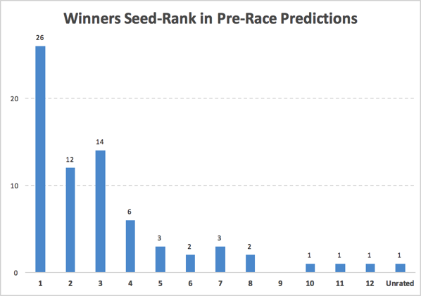
Here’s a look at the places the eventual race winners have been seeded based on previous results and the start lists:

With 36 IM-distance races, there are 72 winners (one each for the male and female race). My algorithm has correctly predicted the winner in 26 races (36%), and another 26 winners were seeded in #2 or #3 (winning frequency of an athlete seeded on the podium: 72%). Only three winners have been seeded higher than 8th: Kirill Kotshegarov was seeded 10th at IM Chattanooga, Mel Hauschildt was seeded 11th at IM Melbourne, and Matt Hanson was seeded 12th at IM Texas. There was also one unrated (and therefore unseeded) winner in 2015: Jesse Thomas won IM Wales in his debut Ironman.
The numbers would be even better when only considering the athletes that finished a race. Only including athletes that actually started increases the frequency of picking the right winner to 39% (and one of the podium picks to win the race to 80%), also discarding athletes not finishing would have yielded 42% and 83% of the winners.
Time Predictions
In my pre-race posts, the finish times are predicted for each athlete that has raced an Ironman race before. The algorithm considers the previous finishing times of an athlete and the course that the race is going to be held on.
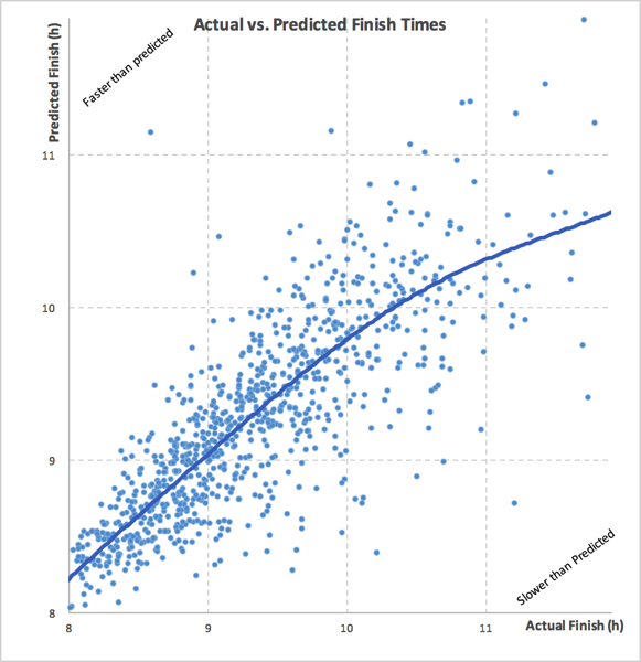
The following graph compares the actual finish times to the predicted finish times (each data point is one dot on the graph). Dots towards the upper left are results where the actual finish was faster than predicted, dots towards the lower right are results that are slower than predicted.
The graph shows actual and predicted times between 8 and 12 hours (only 11 faster results/predictions and 15 slower ones are missing).

I have added a “trend line” that shows the best fit of all the data points, highlighting the fact that most of the data points are pretty close to the “diagonal” (where actual = predicted). Between 8 hours and 10 hours the algorithmic predictions are pretty good on average (maybe predictions are a bit too fast around 8 hours). Towards 10 hours finishing time and especially over 10 hours the predictions are too fast: This is caused by “explosions” that lead to very slow times even for athletes that have been predicted to be relatively fast. To put it another way: Finishing times over 10 hours are most often bad races that are pretty much unpredictable using only data.
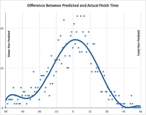
Here is another way of looking at how far off the time predictions have been from the actual results:

The graph shows the number of results in one minute bins of difference between predicted and actual finishing times. Data points towards the right are faster than predicted, they are slower than predicted to the left. Again a trend line smoothes out the statistical “noise”.
A few observations:
- In a range roughly between -40 minutes and +40 minutes the graph is pretty symmetric and is very close the normal distribution.
- As noted above, there is relatively large number of “explosions” with large negative differences, resulting in a non-symmetrical distribution on the edges of the graph. (There are 49 results that are more than 60 minutes slower than predicted, but only 10 that are more than 60 minutes faster.)
On average, the predictions are -4.7 minutes off the actual finish time (i.e. the actual finish is slower by close to five minutes). An average close to 0 means that on average the predictions are closer to the actual finish. The standard deviation is 31.8, this means that 68% of the time differences are between -36.5 and 27.1 minutes (-4.7 +/- 31.8 minutes). Usually, a smaller deviation corresponds to a “better” prediction.
The standard “statistical” way of measuring the dependence between two data sets is correlation. Correlation is +1 in the case of a perfect linear relationship, −1 in the case of a perfect inverse relationship, and some value between −1 and 1 in all other cases, indicating the degree of linear dependence between the variables. A value around zero indicates that there is less of a relationship (closer to uncorrelated). The closer the coefficient is to either −1 or 1, the stronger the correlation between the variables. The predictions and actual finishing times have a correlation of 0.77, indicating a pretty strong dependence between the two data sets.
Comparing Other Prediction Strategies
When trying to predict a completely random event (the classical example is a “perfect dice”), the correlation between the actual events and the predictions won’t be very high. When only working off previous results, anything that happens before a race – for example a good block of training, a slight injury – will influence how fast an athlete is able to go on race day, as will random events during the race (e.g. getting punched during the swim, technical issues on the bike). Therefore a “perfect prediction” (resulting in a correlation of 1) is impossible, and in order to determine whether a correlation of 0.77 indicates a “good predictor” or not, one has to compare the results of my algorithm to other predictions.
I am not aware of anyone other than me publishing time predictions for Ironman races on a regular basis. (Please let me know if there is!) Therefore, I am comparing my predictions to a few much simpler strategies:
- Last Finish: “You are only as good as your last race” (prediction = last IM-distance finish)
- Best Finish: “My best time is a sub-x” (prediction = fastest IM-distance finish)
- Average Finish: “I usually finish around y” (prediction = average IM-distance finish)
- Average Last Year Finish: “This season is going great” (prediction = average IM-distance finish in the last twelve months)
Here’s a comparison of the correlation of these different methods and my comments:
| Number of Data Points | Average Difference | Standard Deviation | Correlation to Actual Finish | Comments | |
| Last Finish | 943 | -0.75 | 41.14 | 0.649 | Good on average, but wide deviation and lower correlation |
| Best Finish | 943 | -21.48 | 39.59 | 0.659 | Slightly better deviation and correlation, but large average difference |
| Average Finish | 943 | -0.84 | 35.77 | 0.706 | Good on average, but wider deviation and lower correlation than TTR Predictions (still better than last/best finish) |
| Average Last Year Finish | 877 | -1.89 | 35.08 | 0.706 | Almost the same as the Average Finish, but applicable for fewer cases |
| TTR Predictions | 930 | -4.70 | 31.81 | 0.770 | Lowest deviation, highest correlation |
Summary
The Prediction Algorithm I use to calculate the expected times in my pre-race posts provides better predictions than simpler prediction strategies. My model certainly has limitations, but the large number of “successful” winner predictions and the high correlation show that the time predictions and the conclusions drawn from them are pretty much valid. I think my analysis is quite good at telling the “data part of the story”.
While the “data part” is an important (and impartial) part of the story, it is still only a part of the story. A coach or teammate that has been able to observe an athlete getting ready for a race has additional (and more current) information available – even if that is not always fully objective.
The tension between past performances, the uncertainty of a future performance, the challenges athletes face in their training and the hard work they put in to be better in their next race .. that’s why I still love following the races!