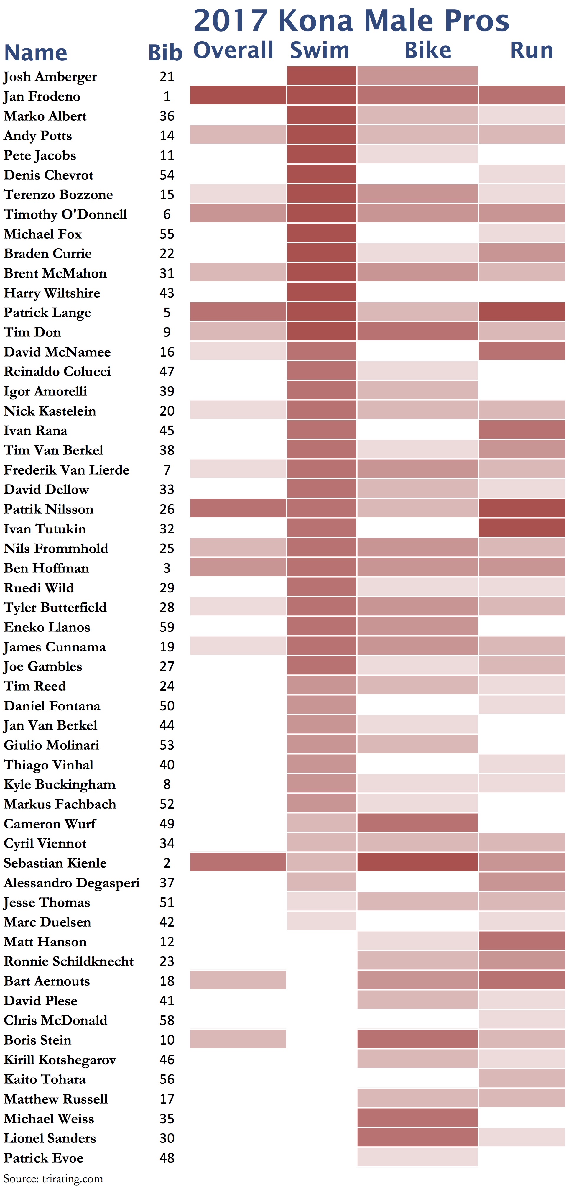
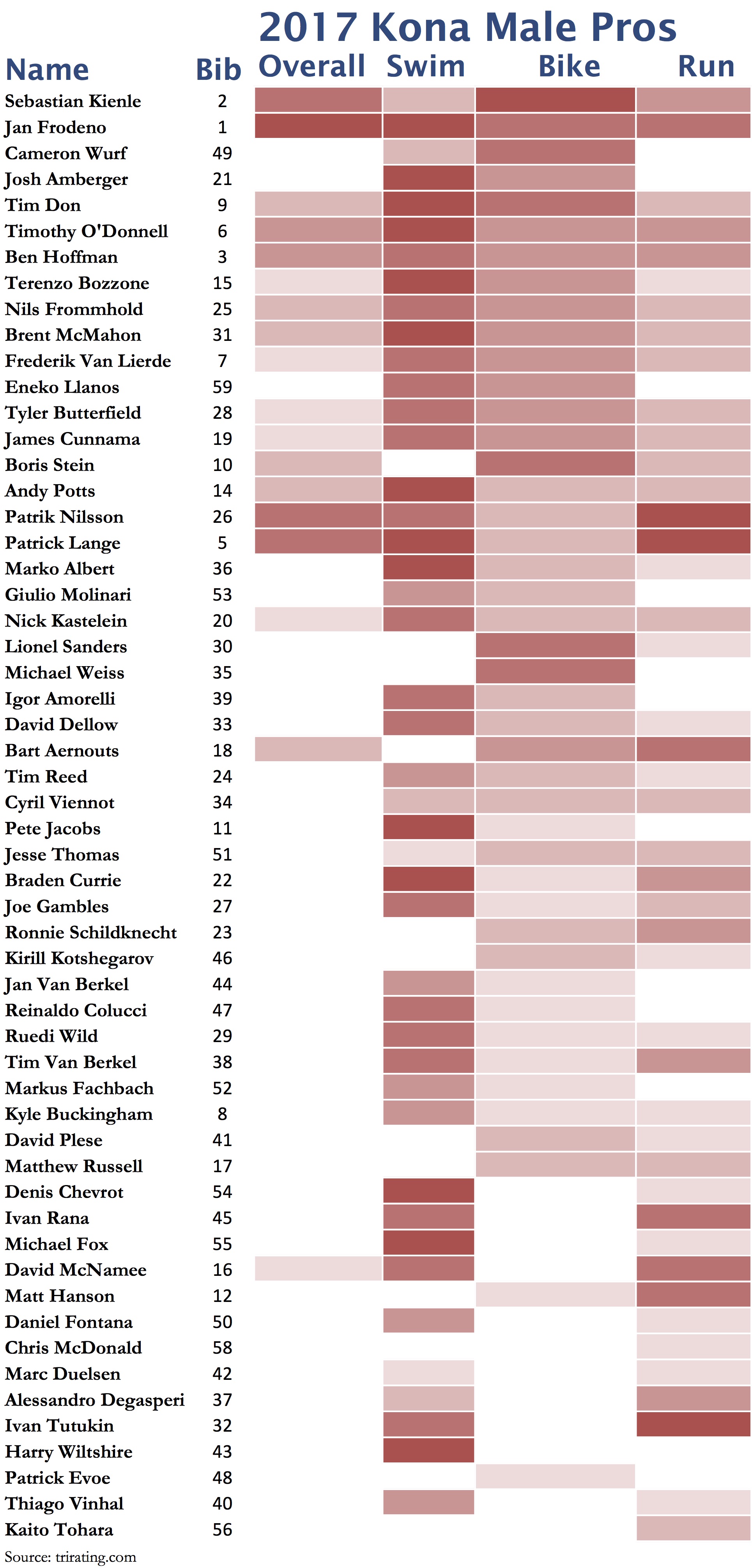
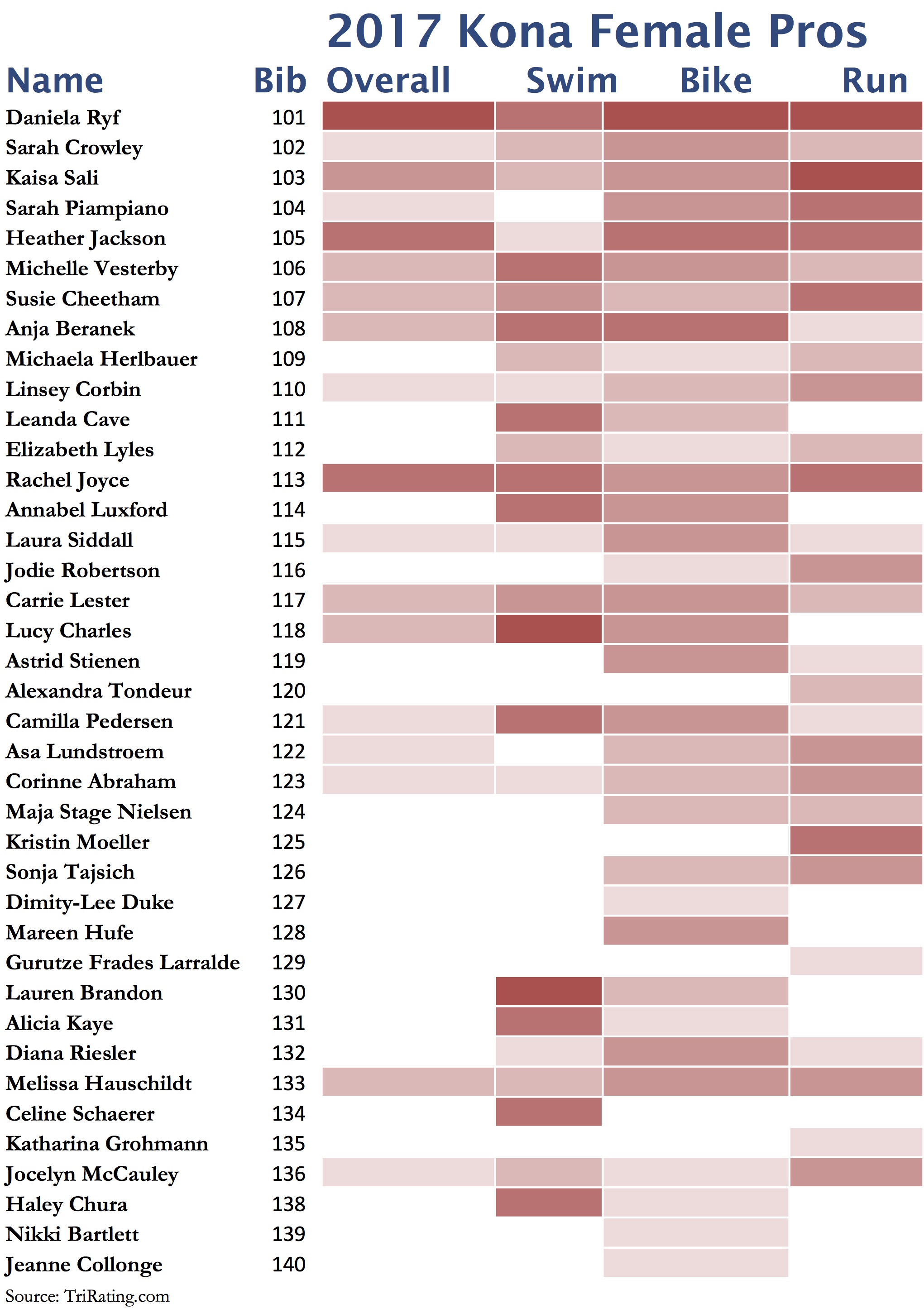
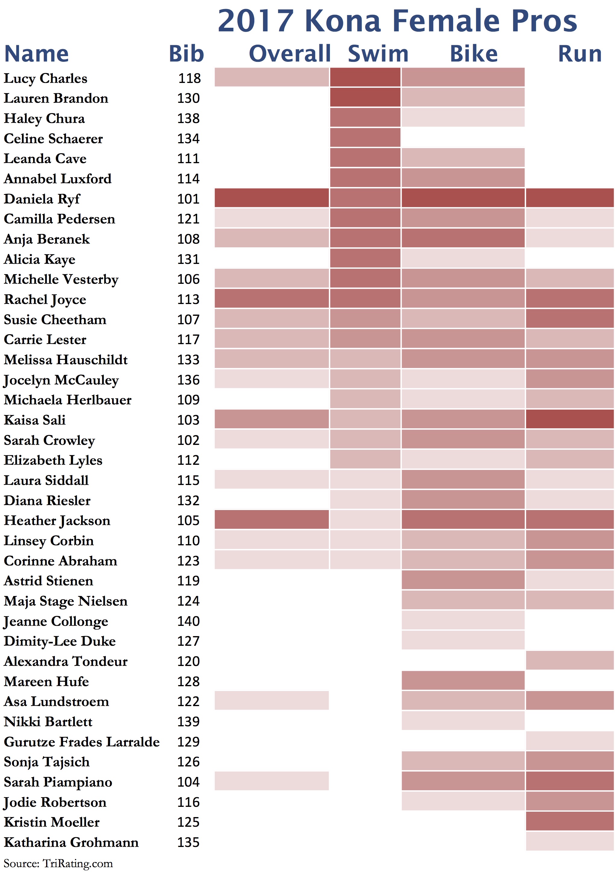
I’m using a five-level system to show an athlete’s strength and weaknesses compared to the best athletes in the field. Here is compact way to look at the data, showing the whole field in a “heatmap”. In these graphs, a darker red corresponds to more stars (faster/better chances), white is equal to no stars. This post contains three different heat maps each for the men and women: Sorted by bib numbers, sorted by expected swim and sorted by expected time in T2. This gives you a quick look at where the favorites are expected at the different points in the race and if swim or T2 leaders are likely to play a big role in the final results.
Each of the heatmaps is “clickable”, this will give you access to higher-res version of the heatmaps.
Men
Sorted by Bib Number:
Sorted by Expected Swim:
Sorted by Expected T2 Time:
Women
Sorted by Bib Number:
Sorted by Expected Swim:
Sorted by Expected T2 Time:
